Trying to decide which email marketing platform is best for your business? I’m breaking down the big differences between Flodesk and ConvertKit so you can make the right decision. I hope you enjoy this ConvertKit and Flodesk review.
Over the past decade, I’ve tried out several email marketing platforms for my blog and business. Up until recently, I used ConvertKit, but decided to give Flodesk a shot shortly after hearing about them and receiving gorgeous emails from other businesses and bloggers using their platform.
At the end of the day, both platforms are incredible and powerful, but based on your own unique needs, I hope this post helps you to decide which platform—Flodesk or Convertkit—is best for your small business or blog.
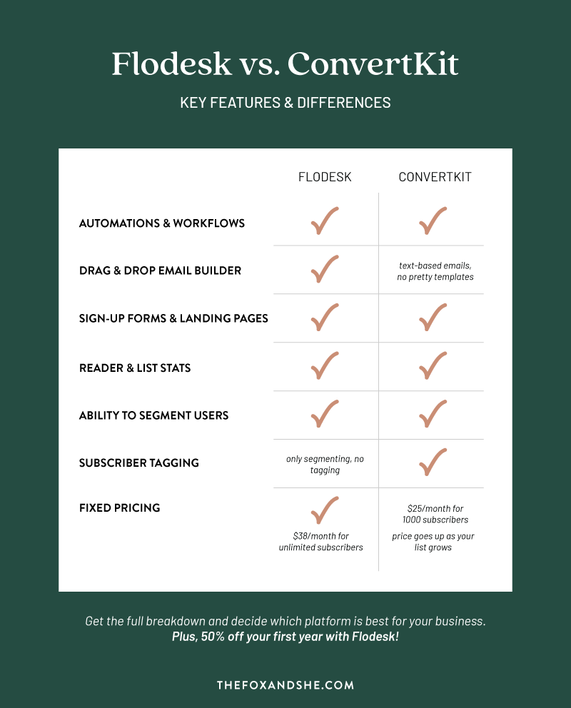
Here’s a quick, visual breakdown of the key differences between these two platforms to give you a better idea of which one might work best for you.
Flodesk Review 2021—Quick Overview & Key Features
Flodesk is newer to the scene, but the company, built by two women, Martha and Rebecca, is growing in popularity and for good reason. It does all the same stuff most other email marketing platforms do, and best of all—it’s beautiful and more intuitive than many other platforms I’ve used in the past. And if you’re curious, I’ve had experience with MailChimp, Constant Contact, and ConvertKit as well.
It may not have quite as many features as ConvertKit, but it’s catching up quickly, and quite honestly, you might not need all the features that ConvertKit has to offer—I found that I didn’t.
What I love about Flodesk is how user-friendly it is, even my friends who say they are not tech savvy have used it with ease. So, if you’re thinking “hi, that’s me!” then don’t worry, you can have no tech skills and still easily create beautiful emails, set up workflows, make gorgeous sign up forms and landing pages and so much more.
Now, let’s walk through some more Flodesk features in depth so you can see how powerful this platform is!
Gorgeous & Unique Email Templates
Before Flodesk, the only way I was able to create unique layouts was to design them on desktop then manually upload them and link them.
Ugh, it was a pain.
Thankfully that is no longer an issue—Flodesk email templates are honestly stunning. They will instantly elevate the look of your brand. They make it incredibly easy to integrate your own unique branding too—everything from logos to colors and even a wide selection of unique fonts that give emails a super custom looking feel. Hint, hint—most other platforms do not have options for fonts like this. As a designer, this is HUGE!
Here are a few Flodesk email examples to give you an idea of what you can do with it!


By the way, these email templates come with your account—no design work or coding required by you. You just swap out colors, images, fonts and texts and hit send!
Easy to Build Emails
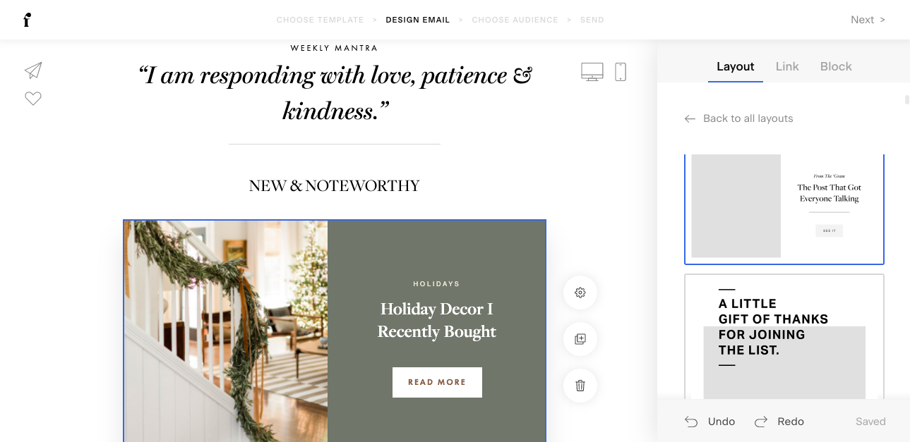
If you don’t know any code—you’re in the right spot! Emails are so easy build, as I mentioned, there are so many amazing templates designed for you, but you can also easily create your own custom Flodesk templates (and save them for future use!) by simply dragging and dropping layouts, text boxes, images, quotes, buttons, fancy text, video, links, Instagram and more. Here’s a peek at the interface.
It’s as if the founders said, we know what it’s like to want to create something awesome but not have the skill, so we’re just going to do it for you. And they delivered—actually, I think they over-delivered.
Automations & Workflows
Both email marketing platforms have automation, which I highly suggest using whether you’re a blogger or a business. You can set up a “Welcome” series of 3-5 emails that sends automatically and introduces you, your product or services and point of view to any new subscribers. It’s a great way to save time and start building a good relationship with your new subscribers.
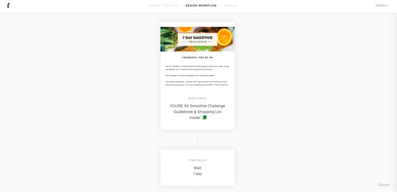
Flodesk calls their automations, “workflows” —they are incredibly easy to set up. It’s essentially the same as creating an email, but instead you build them in a series. You pick what triggers will send each email and there’s options for adding specific segments of your audience. Basically, it allows you to tailor your user experience based off your users’ different interests.
Subscriber Segmentation
As your business grows, you might want to be able to segment your audience into different interests. This allows you to send specific users targeted emails and information, based off what they told you they want to hear about, or based on which freebies they signed up for on your page. This is when the nerd in me really starts to geek out! It’s like a little window into your subscribers brain that lets you know what type of content is working, and is most interesting so you can tailor your own content strategy to bring them more of that.
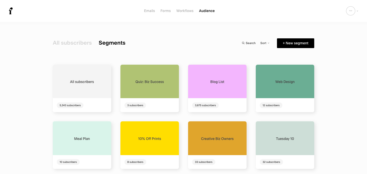
In Flodesk, you can simply create a new segment within your audience. To get people on that segment, you select your desired segment when you’re creating a landing page or opt-in form. You even have the option to let people select multiple segments or interests themselves in your form—that used to be a struggle in the past, so happy they have this amazing feature.
For example, that means on your form you could ask if people are interested in a weekly newsletter, your products or services or just want a once a month update. Again, those are just examples, you can break this down however you’d like!
Easy to Create Forms & Landing Pages
Before Flodesk, I also used Leadpages just to create high-converting, beautiful pop-ups, landing pages and opt-in bars. Leadpages is amazing, but if you’re like me, it’s easier if everything is in one place. Plus, with Flodesk, I no longer have the need to pay for Leadpages, which can get pretty pricy.
Now, I create forms and pop ups directly from Flodesk. They match the branding of my website and other emails and just look so dang professional, plus—they convert! Which is really what matters the most.
Flodesk Integration to Other Platforms
Most apps that I use work with Flodesk, and if they don’t, they have the option to connect to Flodesk with Zapier. Zapier is very affordable and easy to use as well! For example, I use Zapier to integrate my quiz sign-ups to Flodesk. My guess is that these integrations will only improve over time, but for now it’s still an easy work around.
You can also connect Flodesk to Squarespace. You do have to have a Business account with Squarespace for it to work, but it’s very simple to integrate after that. Here’s a tutorial on how to connect the two platforms if you need some help.
Good Subscriber Stats
You can easily look at your email statistics by clicking on a little graph button at the bottom of the email. It pops up to show you sends, open rate and click rate. You can click through for more details. Over time, you can start to understand which emails and content are performing better, and maybe even decide when it’s time to prune your list. This means removing subscribers who haven’t opened an email from you in a certain amount of time. Even though you have unlimited subscribers, this is still a good practice to keep your list healthy!
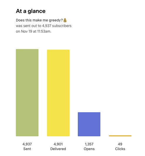
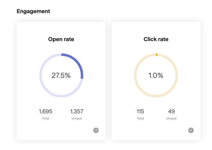
You can easily see which pop-ups and landing pages are getting the most sign-ups, as well as details on your workflows and your audience segments.
Flodesk Pricing
One huge perk in my eyes is that Flodesk prices is fixed. You pay $38/month for unlimited subscribers, while many other platforms have sliding scales that go up as your subscriber list goes up.
The Flodesk free trial lasts 14 days, and they gave me a link to share so you can get Flodesk 50% off your first year! No Flodesk promo code necessary, just click the link and you’ll get the discount.
Should You Choose Flodesk?
Overall, Flodesk is an extremely easy-to-use platform, it’s beautiful, well-designed and has all of the major features I need to run my business. The Flodesk customer service team has been amazing any time I had a question, which hasn’t been often because it’s so easy to use, and it’s affordable! If you’re getting started or looking for an email marketing platform that’s easier to use, I would choose Flodesk in an instant.
If there are more features you’re looking for like more targeted tagging and serious automation rules, ConvertKit might be a better option for you—let’s chat about ConvertKit now!
ConvertKit Review
ConvertKit, while different than Flodesk, is an incredible platform and very powerful—especially when it comes to fine-tuning your targeting and tagging. It’s also been around a lot longer and has a bigger team than Flodesk. Their customer service is great as well.
Let’s go over the key features and biggest differences between these two platforms.
ConvertKit Deliverability
ConvertKit is known for having high deliverability, meaning the majority of your emails actually reach people’s inboxes. This can be an issue when sending emails to your list, obviously, you want as many people as possible to reach them. Since ConvertKit emails are very simple—text-only, I think this plays a big part of why they get great deliverability rates.
That being said, I have had no issues with my emails being delivered with Flodesk and find that my open rate is just as high, if not higher.
Great Subscriber Stats
I do think ConvertKit excels in the stats area. I no longer have ConvertKit, so I can’t show you the backend, but there was a tab where I could see my reader growth month over month, and another graph that allowed me to see how many people signed up for specific email segments each day. That might not be necessary for you, but it can be helpful to see if a promotion or social media share or blog post you wrote is doing its job.
Like Flodesk, ConvertKit also gives you details on the open rate, click rate and sends.
These details make it easy to prune your list. Convertkit cold subscribers are people who haven’t opened an email from you in a long time, you can easily tag people based on their last email open and tag them to send one more email before you remove them. This tutorial walks you through the whole process.
Simple Templates
Unlike Flodesk, ConvertKit is pretty much no frills. Most emails I ever created in here were text-only. This is not a bad thing—especially if you’re someone who is sending detailed information and lessons in your email, you might have no need for imagery and fancy text. If that’s you—ConvertKit wins!
Easy User Segmentation
Very similar to Flodesk, you can easily break your audience down into ConvertKit segments based off interest. To take it one step further, you can actually tag users in ConvertKit too.
For example, you could create a link to a product you’re teasing before it’s on sale within an email. Then, you could set the link to also tag anyone who clicks it. Later, you can send an email to anyone who was tagged by clicking the link because they showed initial interest.
Like I said, this might not be a feature everyone needs, but it is really cool and if you get into really niche stuff, this platform is excellent for it!
ConvertKit Visual Automations
ConvertKit introduced visual automations a while back and it definitely makes it much easier to create an automation for someone like me, who is very visual. You can set different rules based off what a user signs up for, or clicks on. You can get very specific here which is definitely an area where ConvertKit works so well.
But again, this wasn’t a feature I was actively using, so it didn’t make sense to continue to pay the higher price for me. Depending on your business, you might definitely need or want these capabilities!
Easy to Build Sign-Up Forms
Convertkit sign up forms are easy to build—you can make pop-ups, inline sign-up bars, landing pages and more. The only downside in my opinion is that they weren’t as pretty. They still work great, and I’m sure that efforts to make them nicer looking will continue as customers demand it, but last I checked, I wasn’t super jazzed with how they looked—which was why I used Leadpages back then.
ConvertKit Prices
ConvertKit is $25/month for your first 1,000 subscribers, and as your list grows, your price goes up. This was a big reason why I switched. At the time, my list was over 3,000, which meant I was paying around $66/month, which isn’t crazy, but Flodesk provided me with what I needed, and better design, at a cheaper cost.
You can sign up for a free ConvertKit trial and use some of the features as long as your list is under 1,000 subscribers. With this ConvertKit free plan, you don’t get access to automations, but it might be perfect for you as you get started, or just want to test it out.
Frequently Asked Flodesk Questions
Does Flodesk integrate with Squarespace?
Yes, but you need a Business account with Squarespace for this to work.
Does Flodesk integrate with Showit
Yes, you can drop any embedded code within a Showit website (my website is built by Showit with WordPress).
How much is Flodesk?
Flodesk is a flat rate of $38/month, get 50% off your first year subscription by clicking this link.
Does Flodesk connect with WordPress?
Yes, you can drop in your sign-up forms easily anywhere you want in WordPress—on a sidebar or even on a specific post.
Why I Chose Flodesk
There are lots of Flodesk competitors out there, just do a quick Google search and you’ll get endless options for email marketing platforms. But, after my experience and after using many other platforms, it wins big in my book. The main things that sold me:
- Better email design options
- More creative control over my emails
- Better sign-up form design
- Easy segmentation of audiences
- Overall—so much easier to use
- Pricing—ConvertKit pricing was getting too high for me and Flodesk fixed pricing means I know that expense won’t change month to month
Don’t forget, if you want to get 50% off your first year, click here to snag it!
In Conclusion
I hope this Flodesk review and ConvertKit review helped you decide which platform is best for you and your business. I’d say for most people, Flodesk will be perfect and give you endless options for designs, sign-up forms and segmentation. I’ve loved making the change and have actually felt more empowered to grow my list because it’s so easy! Any other questions I missed, feel free to email or DM me on Instagram!
BTW, the most profitable blog niches and how to choose one, and how to find great keywords for your website or blog.