

We’re back with another launch! In this fun design we played with lots of micro-animations, textures and cool cut-outs to create a custom home for Jaimie’s digital notebook.
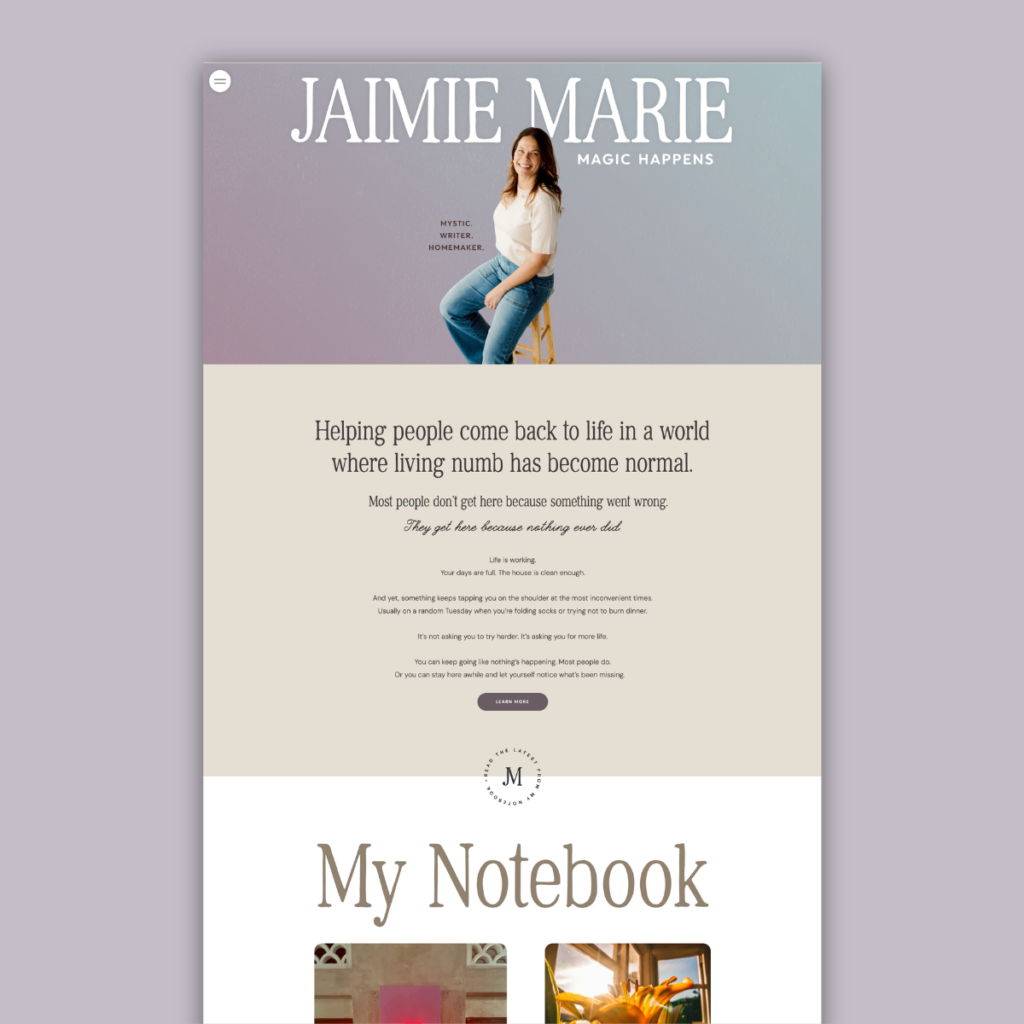
Case Study: A Digital Home for Jaimie Marie
Some brands need a website that sells a product. Jaimie Marie needed something different: a space online that actually feels like her. As a mystic, writer, and homemaker who helps people “come back to life in a world where living numb has become normal,” Jaimie’s work lives in a tender, in-between place — spiritual but grounded, reflective but real. Our job was to design a site that could hold all of that without flattening it into another generic wellness template.
The Brief
Jaimie’s message centers on a simple but powerful idea: magic isn’t fantasy, an aesthetic, or a perfectly curated life online — it’s the energy between heaven and earth, experienced in real life. That tension between the mystical and the mundane (laundry, dinner, a random Tuesday) needed to show up in the design itself, not just the copy.
The Design
We built the site around a calm, mystical palette — dusky mauves and plums fading into warm, sun-bleached neutrals — so the page itself feels like it’s shifting between worlds, the same way Jaimie’s writing does. A soft gradient that shifts slowly (so subtly you may not notice, but it feels alive). This carries the eye from the hero image straight into her mission statement, so the transition from “who she is” to “what she offers” never feels abrupt.
Typography does a lot of the emotional work. A tall, elegant serif anchors the big statements, while a flowing script surfaces just the words that need to land differently — “real life,” “nothing ever did” — letting a single phrase carry weight without shouting. Buttons stay soft: rounded, muted, lowercase-adjacent copy that invites rather than demands.
We layered in small, hand-drawn touches like a butterfly line illustration that reappears across pages that keep the site feeling personal and a little bit magic, rather than templated. I added small micro-animations throughout the site to help draw the reader in and have it feel more alive than static.
The navigation stays minimal on purpose: a single menu icon opens into a full gradient panel with her logo, social links, and a search bar, keeping the homepage itself uncluttered and slow-paced — matching a message about presence, not urgency.
The Result
What used to be scattered across social platforms now has one cohesive home — one that reads as calm, intentional, and unmistakably hers. Every scroll builds the story a little further, from the hero image, into her philosophy, into her writing, into an easy next step for someone who wants more. It’s a site that doesn’t just describe magic — it tries to feel like it.
We loved getting to build a brand as layered as Jaimie is. If your online presence feels like it’s underselling who you actually are, let’s talk.


